
 Julian Abich, Ph.D., Sr. Human Factors Engineer Julian Abich, Ph.D., Sr. Human Factors Engineer I became a recreational skydiver in June 2016. Why would I learn to jump out of a perfectly good airplane you ask? Well, because it's fun (See Figure 1)!!! And if you haven't done it yet, I highly recommend you do! But I am not here to convince you to go. What I do want to briefly write about is my user experience with the new United States Parachute Association (USPA) Skydiver's Information Manual (SIM) mobile app (that's a mouthful). The purpose of the USPA SIM is to provide the basic skydiving standards, policies, training programs, and recommendations for safe and enjoyable skydives (USPA SIM, 2018). What they have done is take 200+ pages of content and create a mobile app. It was released this year (February 2020). As is the case for most professionals in the human factors or usability fields, it's hard to not immediately critically evaluate any piece of software or technology that dare cross my path. I won't get too far into the weeds, but I do want to highlight a few issues I came across and provide recommendations for improvement. I say these things not to hurt, but because I want this app to be a success. Let's dive in! [Ba-dump tsss]  Figure 1. Me doing a backflip during accelerated freefall training Figure 1. Me doing a backflip during accelerated freefall training  Figure 2. Splash screen mockup Figure 2. Splash screen mockup When the app is first launched it goes directly to the introduction content. This content is exactly was is present in the digital/hardcopy manuals. Surprisingly, there is no splash screen (same thing as launch or startup screen). It may seem trivial, but there are millions of apps on the market, so first impressions are important to keep users intrigued and wanting to continue further. Adding a simple splash screen can help reinforce the identity of the organization or brand. It also helps initiate the user's journey. A simple suggestion is provided in Figure 2. On the first page you can see there are two floating icons on the bottom of the screen (Figure 3: Left). I assume the house icon is supposed to bring you to a home screen, but this introduction page seems to be the home screen. And if you navigate to any other content in the app, these icons no longer exist. I would expect the home screen icon to bring me to an organized dashboard or menu of content. The second icon says 'glossary' and if tapped it does bring you to a glossary. But the icon is transparent and hard to read over the other text in the background. Simple solution is to remove them unless research was conducted, via front-end analysis or usability evaluation, and identified users really want these items quickly accessible. If so, then dedicate a space on screen for it to always be present. A recommendation is to add a visible menu at the bottom of the screen (Figure 3: Right). This menu could also be programmed to hide, yet still be easily accessed with a quick swipe up. This will eliminate the need for the hamburger menu currently at the top. Other functional icons can be placed here as well, such as a search icon and an appendix icon (both of which are currently accessed from the hamburger menu icon). 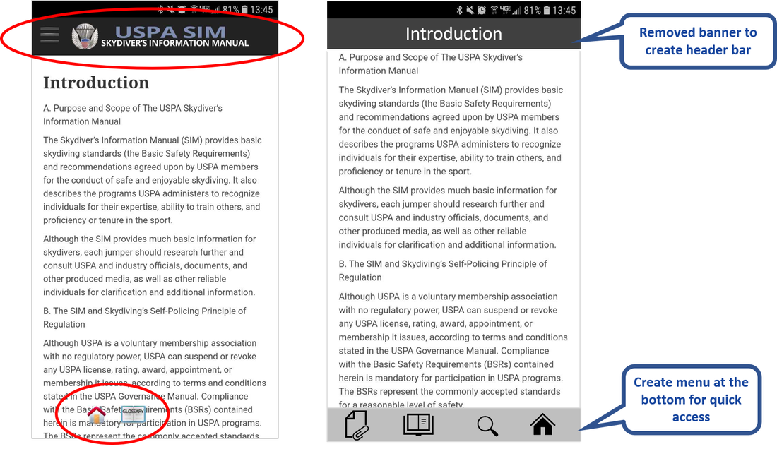 Figure 3: (Left) Current app interface and home screen of USPA SIM mobile app. (Right): Mockup redesign of menu, title bar, and icons. Another suggestion is to remove the banner across the top with the USPA SIM name and logo. Users don't need to be constantly reminded that they are in the app. They will know because of their interaction with the content. Either remove this completely to create more space for content or use it as a header bar to provide context for the content on that page (Figure 3). I somehow came across two different versions of the glossary depending on how I navigated to it. When opening the app, if you click on the hamburger menu (the icon with three stacked horizontal bars on the top left) and choose the glossary it takes you to the one on the left in Figure 4. But if you leave it and access it again, it changes to the one on the right in Figure 4. Differences are seen in the search bar and font size of glossary terms. Choose one version and make sure it’s the only one in the app. Regarding the search bar function, all it does is highlight the text in the glossary, which can only be seen when you scroll through the terms. It does not compile a list of the search results with links to those specific terms that contain the searched words. Also, there are some glossary terms that suggest to see another term (Figure 4: Left). These suggestions should be hyperlinks to the indicated glossary term. 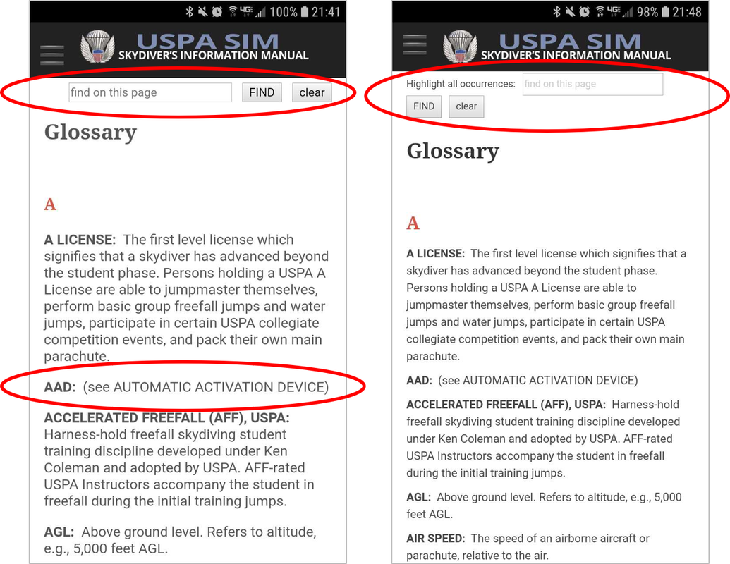 Figure 4. (Left & Right) Both versions of the glossary that were found in the app. There are a few other issues regarding the app functionality that I could address, but I want to discuss a more important issue. It's more of a concern about the overall app. I've experienced this with many other apps, especially education focused ones. Very often customers want to create a mobile app as a way to support and promote mobile learning. And for some reason, they take their textbooks, manuals, etc. and create a mobile app version of it. So instead of leveraging the technological functionality that is offered with a mobile app, the app is forced into the format and structure of a textbook. With a mobile app, the content can be better organized for easy and fast access. 200+ pages of content is a lot, so break it down into smaller groups to facilitate consumption and retention of information (i.e. microlearning). Hyperlinks can help users navigate quickly to content both within and outside of the app. Graphs, tables, figures, and illustrations that work in a textbook won't always work in a mobile app. This is usually because of size and legibility. Rework them into a mobile presentable form and take advantage of the use of animations and videos to help convey content. There are quizzes and study sheets contained within the content. Makes those much more easily accessible, rather than have them buried within the extensive amount of content. My conclusion is that there is an opportunity to provide the skydiving community access to all of this updated important information in an easily accessible and portable format. Work with a team that understands instructional design, training, and usability. They (we) can help you design an engaging app that effectively helps new and current skydivers learn and retain this information. Not only will it help improve usage, it will contribute to the safety of the sport. Blue skies! Recommendation Recap:
References:
United States Parachute Association (USPA) (2018). Skydiver's Information Manual. Retrieved on Feb 20, 2020 from https://uspa.org/SIM. USPA SIM (Android): https://play.google.com/store/apps/details?id=org.uspa.app USPA SIM (Apple): http://appstore.com/apple/uspasim
0 Comments
|
AuthorsThese posts are written or shared by QIC team members. We find this stuff interesting, exciting, and totally awesome! We hope you do too! Categories
All
Archives
June 2024
|
 RSS Feed